
Case study · Concept
Better filters for Tamara.
Tamara lets you split what you buy into monthly payments, with deals from lots of stores. I tried to make its search filters help you decide faster.
The problem
I was looking for a budget tablet on Tamara. The filters jumped around when I tapped them, and I couldn't tell what a tap would do until it was done.
The monthly amount, the thing Tamara is built on, showed up late.
The goal
Make it quicker to get from endless deals to the one you'll buy.
Filters you can predict, and a way to shop by what you can pay each month.
Same taps, two apps.
On the left, the Tamara app as I use it today. On the right, my version.
I recreated today's screens myself from using the app, so small details may differ from the real thing. Stores, products and prices are made up.
Problem 1
The buttons move, and the list goes blank.
Watch the filter buttons and the list.
Before
After a few taps the buttons fold into one pill, and the list goes blank every time. You lose your place.
After
Buttons turn on and stay put. The list stays, dims a little, and a thin bar shows it's updating.
Problem 2
You only find out what a tap does after you tap.
Watch the product counts in the payment sheet.
Before
Nothing tells you how many products a tap will leave.
After
Every option shows how many products you'll get. Zero is greyed out, so there are no dead ends.
Problem 3
There's no way to sort.
Look for a sort option.
Before
There's no sort button. Popular and Deals Ending Soon act like sorts, sit with the filters, and both can be on at once.
After
Sort gets its own spot under the result count. You pick one, and the list reorders.
A new idea
Shop by what you can pay each month.
Paying monthly is the heart of Tamara, yet you only see the monthly amount near checkout. I brought it to the very start.
The opportunity
Pick what you can pay each month. The list narrows to what fits.
Today, prices show as the total and the monthly amount shows up late in the journey. Putting it first could mean faster checkouts and fewer people dropping off when the real number finally appears.
Pick a budget yourself and watch the list narrow. It takes ten seconds.
A few polishes.
See the count before you tap.
Every option shows how many products it leaves, like "6+ payments, 2 products". No guessing, and no tapping into an empty screen.
Sort that fits.
The sheet shows the full names. The screen shows a short one, so the row doesn't break.
One or many, you can tell.
Pick-one lists, like payment plan, use radio buttons. Pick-many lists, like brand, use checkboxes. Brand also has its own Clear all, so you can start over on brands without wiping every other filter.
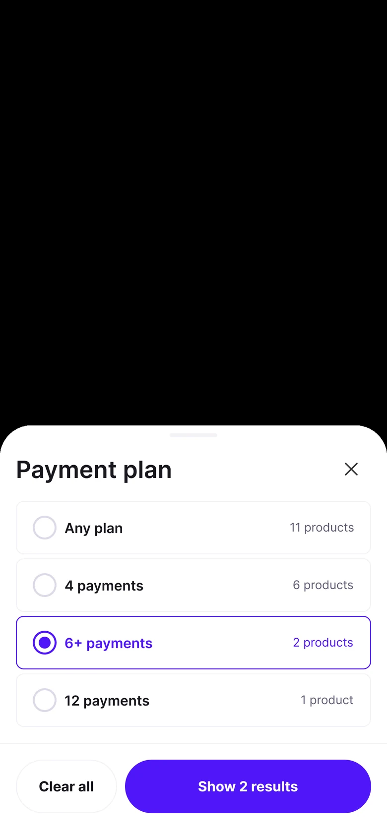
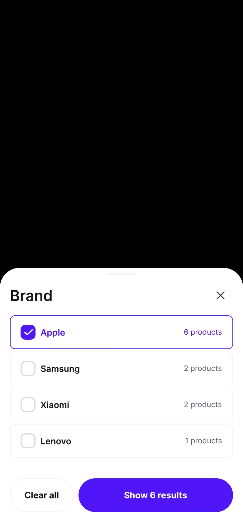
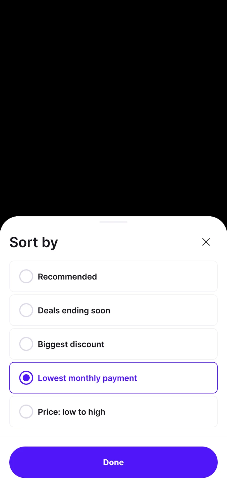
Everything at once
All the filters, in one place.
For people who like to see everything at once. Every option still shows its count.
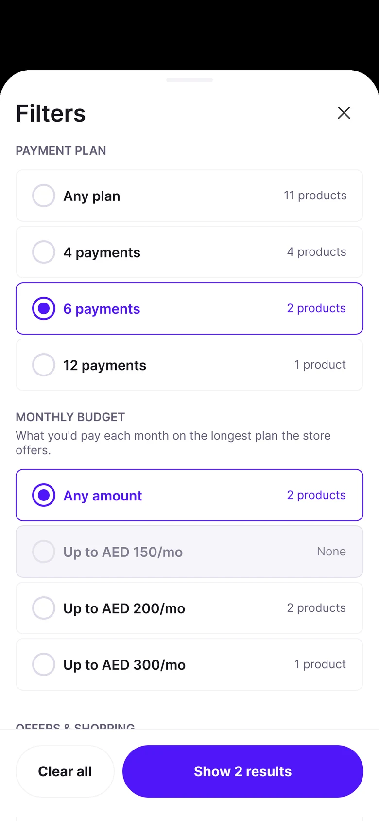
Payment plan
Monthly budget
What you'd pay each month on the longest plan the store offers.
Offers & shopping
Brand
Made from the outside
What I had to guess, and what I’d love to learn.
I only had the app on my phone to go on, so parts of this rest on guesses. The people behind these screens know things I can’t see from here: the data, the trade-offs, and the reasons each choice was made.
So treat this as a starting point. I’d much rather be shown what I missed than defend a guess.
The guesses I made
Guess 01
People shop by what they can pay each month, not only by the total price.
Guess 02
The pill that folds filters together is there to save space, not because people asked for it.
Guess 03
Most products are sold on the longest plan their store offers, so “Up to” monthly amounts are fair to show.
Guess 04
Fewer surprises before checkout means fewer people leave before paying.
What I’d ask first
Question 01
Why do the filters fold into one pill, and what do people do with it?
Question 02
How many people already shop by the monthly amount?
Question 03
Where do people drop off between search and checkout?
Question 04
Which filters get used, and which get skipped?
Question 05
What do partner stores need from search that shoppers never see?
Question 06
What would worry you about trying something like this?